Hartville Pet Insurance
Logo
In 2020, we decided to give Hartvile Pet Insurance a little ‘refresh’ that included a new logo, added illustrations, and a more cheeky vibe. I was apart of the initial rebrand in 2017, so I took the lead on making Hartville the kind of brand we want to represent our pet parent customers.
Our goal for this new logo was to give the product more life, but also projecting our experience as one of the oldest and trustworthy pet insurers.
We wanted a strong, bold typeface, but rounded and tall to seem lightweight and less intimidating.
Lowercase letters to be fun and approachable, but made in a serif font to show trust and confidence.
Needed something timeless that won’t need updated again in 3 years.
We used shades of blue to give off a professionalism, but shifting towards greener hues to stay youthful.
Illustrations


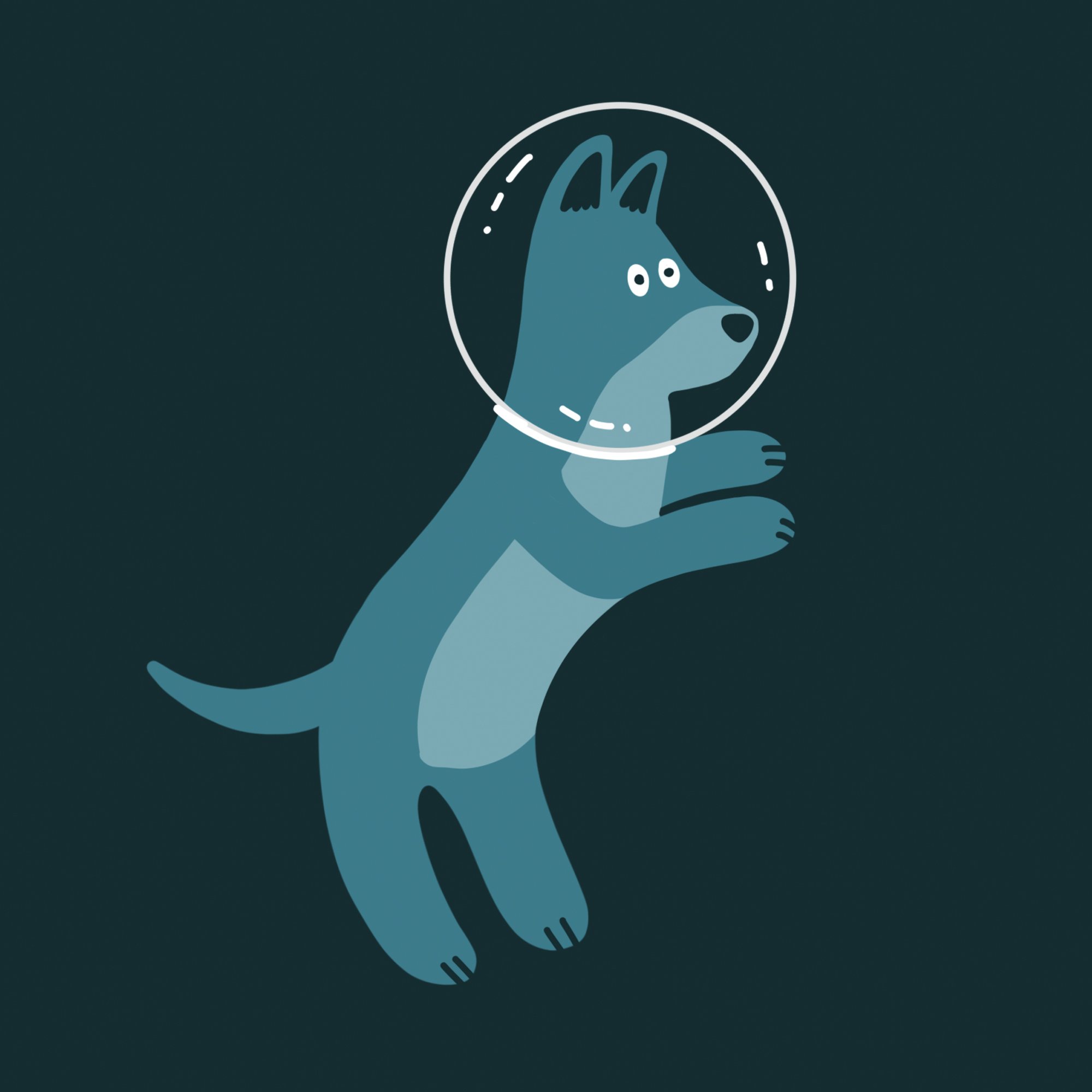
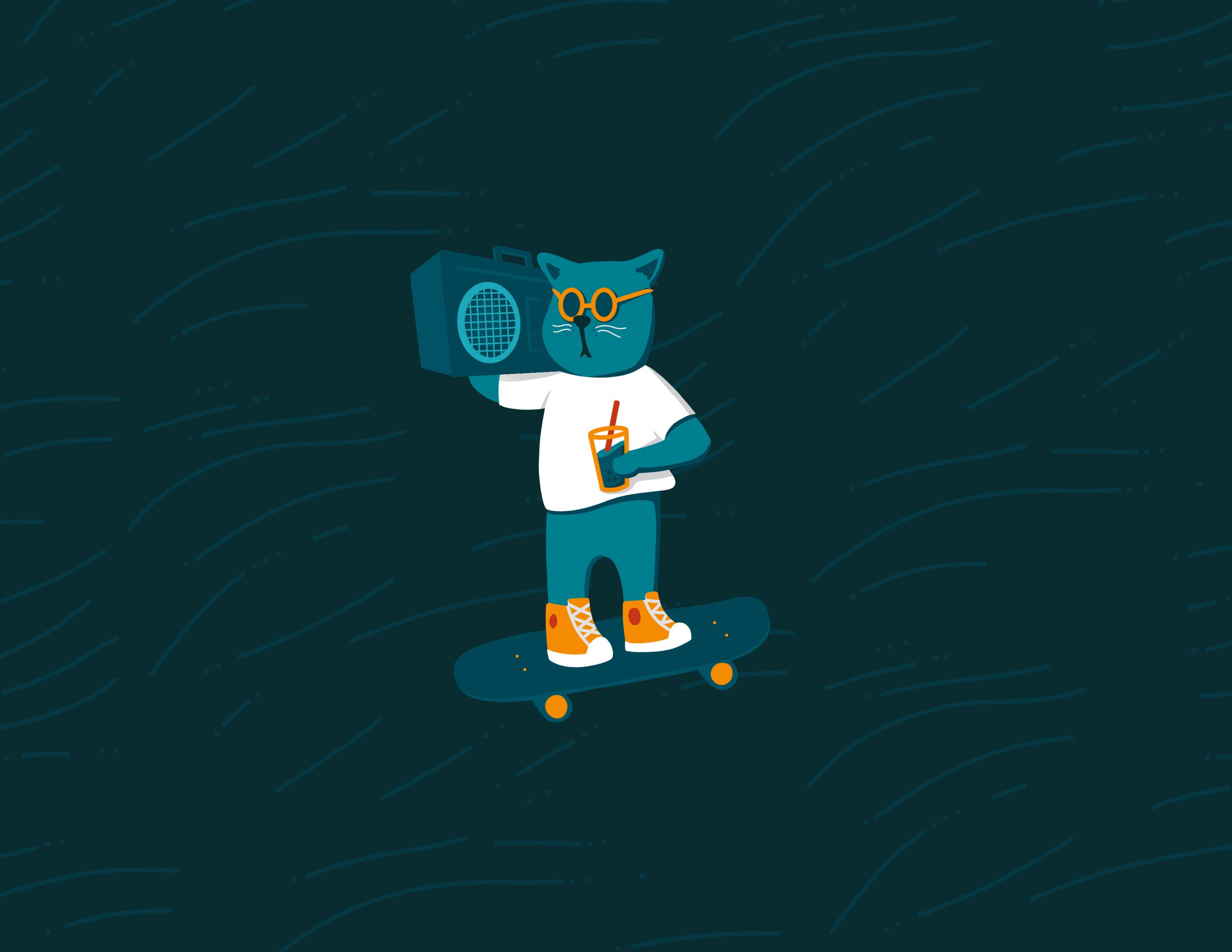
A big part of this brand refresh was implementing illustrations. Pet insurance marketing can sometimes all blend together and kind of look the same, we wanted to make sure we had different enough elements that would be easy to connect to the Hartville brand.
We jumped into creating a library of illustrations. This was important to us because these are made in-house, so no other pet insurance company would have these and they would serve as a visual bookmark for Hartville.
There are also a lot of elements that can be confusing to first time pet owners and illustration provides a great opportunity for users to consume information outside of just reading copy.
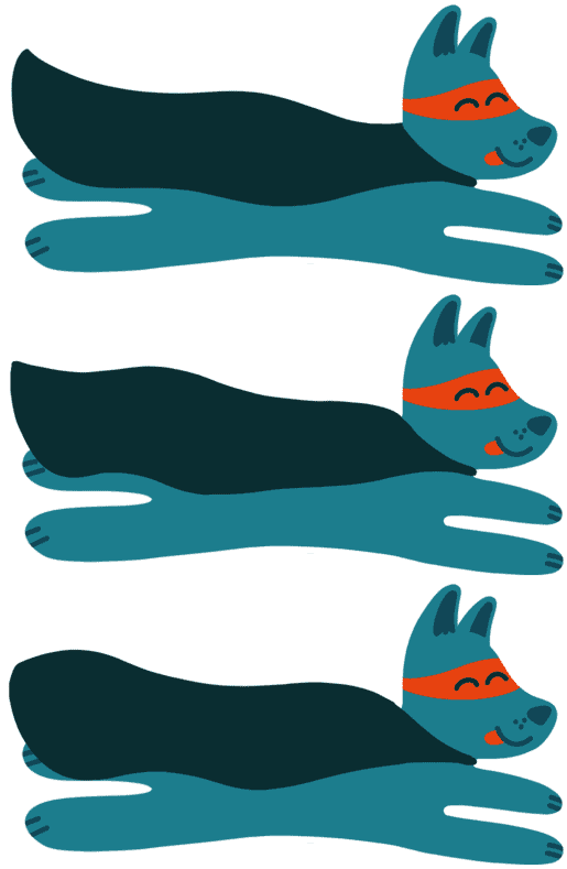
Since this is such a big task to build a library of illustrations, we came up with a template to use so we are not starting completely from scratch anytime we need a new illustration.
As simple as these illustrations are, the different color combinations and body shapes give us a decent variety of compositions.
Video
One of the more tedious parts of this project was getting Hartville Pet Insurance up to speed with the current marketing strategies. I took our illustration concepts and turned them into animations. The outlined font used is also something I created and implemented just for this brand– another element that would belong to only us.
To expand our reach in advertising a bit more, I created video advertisements that were 0:07-0:15 long. They are shorter, punchy, and meant to have an impact by using the sound effects… no matter how gross!
We wanted Hartville to be educational as well– pet insurance isn’t always the easiest thing to understand. High dollar amounts and the state of insurance today can be a bit scary so our goal was to be upbeat and informative.


